Todoapp.Today
Plan today, prepare tomorrow.
They say that every engineer has to build a To-Do app in their life.
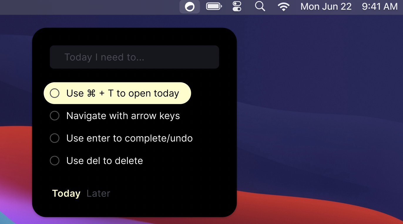
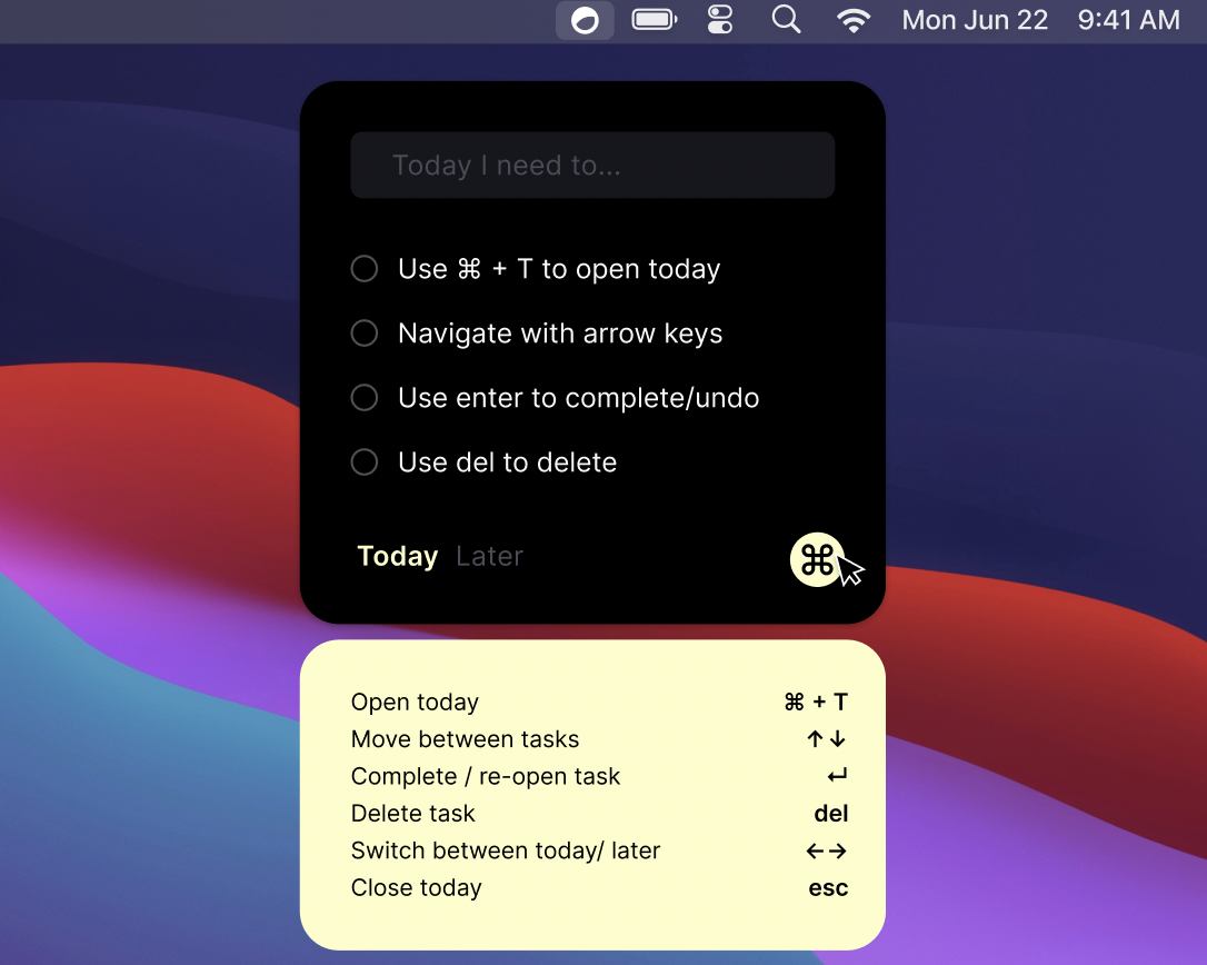
Today is my implementation of a To-Do app, designed by my former colleague and ping pong office rival, Julian Panzer. It is available exclusively for macOS users and it resides discreetly on the menu bar, always within reach. Today is optimized for being used entirely with the keyboard, for pro users like us ;)

If you would like to try it, it’s free, download it here!
Building process and challenges
Today is my first app developed using SwiftUI!
Working with SwiftUI was a lot of fun, it facilitated rapid layout creation and made it extremely easy to build a responsive user interface through state observation. However, as anticipated, certain UI intricacies fell short in comparison to AppKit/UIKit. For example, something as simple as setting the background of a TextField to be transparent didn’t work if such TextField was inside a List.
You can try this yourself and observe that the clear background of the TextField inside a list is not respected:
import SwiftUI

struct ContentView: View {
    @State private var items = ["Item 1", "Item 2"]

    var body: some View {
        VStack {
            List {
                ForEach(items.indices, id: \.self) { index in
                    TextField("Inside list", text: $items[index])
                        .textFieldStyle(.plain)
                        .background(Color.clear) // NOT respected
                        .padding()
                }.background(.blue)
            }
            .frame(width: 300, height: 200)
         TextField("Outside list", text: $items[0])
            .textFieldStyle(.plain)
            .background(Color.clear) // Respected
            .padding()
        }.background(.green)
        .padding()
    }
}
Keyboard integration
Keyboard control is the main differentatior for Today and implementing it was fairly easy. The idea is to add an invisible view as the background of the parent content view, such as:
var body: some View { contentView.background(KeyEventHandling()) }
The transparent KeyEventHandling NSView intercepts all keyboard events and broadcast them using the notifiation center, so that multiple views in the code base can intercept the events and react accordingly:
struct KeyEventHandling: NSViewRepresentable {
  func makeNSView(context: Context) -> NSView {
    DispatchQueue.main.async {
      KeyView.shared.window?.makeFirstResponder(KeyView.shared)
    }
    return KeyView.shared
  }

  func updateNSView(_ nsView: NSView, context: Context) {}
}

class KeyView: NSView {
  static let shared = KeyView()
  override var acceptsFirstResponder: Bool { true }
  override func keyDown(with event: NSEvent) {
    switch event.keyCode {
    // For a list of mapping between keyCodes and keys check this out: https://eastmanreference.com/complete-list-of-applescript-key-codes
    case 53:
      NotificationCenter.default.post(Notification(name: .escKeyPressed))
    case 76, 36:
      NotificationCenter.default.post(Notification(name: .enterKeyPressed))
    case 126:
      NotificationCenter.default.post(Notification(name: .upKeyPressed))
    // etc...
    }
  }
}
Focusing a TextField programmatically
One of the biggest challenge was fine-tuning TextField interactions, specifically setting it on focus after certain events like arrow navigation or shortcuts. I ended up writing a custom Text Field solution using AppKit, inspired by this article.
Then I created a central coordinator to broadcast keyboard events, using the notification center, something as simple as:
func attemptToFocusTextField() {
  NotificationCenter.default.post(name: .shouldFocusAddItem, object: nil)
}
Many places in the app can attempt to focus the TextField. For example, when opening the Popover using a shortcut (implemented using Hotkey), the TextField should be focused so that the user can type a new ToDo right away without using the mouse.
Finally, the TextField implementation can react when receiving such notification and update its internal focus state:
CustomTextFieldImplementation() // not showing for brevity
    .onReceive(.shouldFocusAddItem) { _ in
        DispatchQueue.main.async {
            self.shouldFocus = true // A @State variable that controls the focus or in editing mode
        viewState.currentSelectedItem = nil
        viewState.currentEditedItem = nil
    }
}
Popovers on macOS
Another challenge was generally working with a popover window in the menu bar on macOS. A popover is “a transient view that appears above other content when people click or tap a control or interactive area”. Popovers are more niche and less documented than standard windows. This Popover library is a great entry point to creating and customizing Popovers on macOS, I recommend it as it simplifies most of the interactions that you will probably need to work with.
For example, creating a transparent padding between the main view containing the ToDos and the help view proved challenging, as it requires the popover view to be transparent, which is not supported “out of the box”.
